With the economy still in a tough spot, I was curious to see how much money is spent across every major sport in the United States. Being a huge baseball, football, and basketball fan, I really wanted to see who spends the most money on payroll and who is the highest paid player in all sports. Feel free to play around with this visualization. The insights I found were really interesting and it's amazing how much money there is in sports across the United States. We definitely love our sports and we're willing to pay big bucks for entertainment. Hover over the "Information" icon to get more details on how to interact with this visualization. My insights and analysis are below this visualization. <a href="undefined"><img alt=" " src="http://public.tableausoftware.com/static/images/Sp&am...
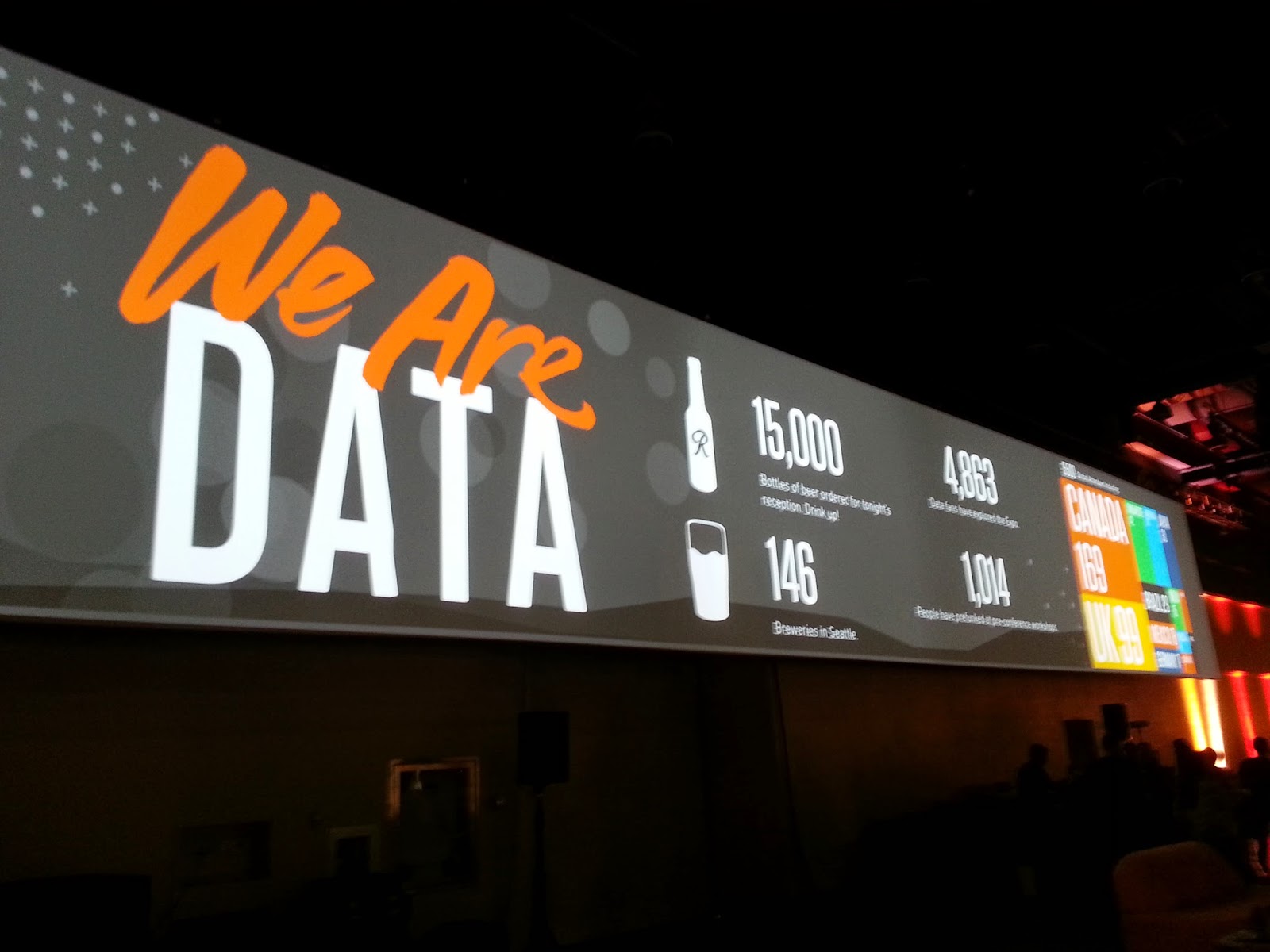
Having just returned from the 2014 Tableau Conference , I was debating whether or not I should blog about it. I realized I've received so much from the Tableau Community over the years that it would be a shame to not share my thoughts. So, here we go ... TABLEAU CONFERENCE IS BIG! One thought that definitely stuck out was the sheer size of this year's conference! There were 5,500 attendees so it was definitely crowded at times. But it was a reminder of the incredible growth that Tableau has been experiencing and how, so many others have found Tableau to be a tool that not only gets the job done, yet also delights. I like how one person said that Tableau is the closest thing he's found to playing a video game at work . I totally agree! If you're going to attend one data/analytics conference during the year, this is the ONE you want to go to. I was anticipating the first keynote because it always sets the stage for what is to come. Having heard Christian ...
I decided to enter The Tableau Interactive Biz Viz Contest and since I needed to use a financial data set, I chose to compare Apple vs Microsoft Stock Performance. Having been a big Microsoft fan back in the 90's, I thought it'd be interesting to compare Microsoft against the hottest company at the moment, Apple. Both companies have had interesting peaks and valleys. While Microsoft has been on the decline, Apple has been on a tear. It was interesting to look at the historical min, max, average stock price, and average volume of the two stocks. I then calculated the % daily difference to see the changes in close price compared to the prior day. Then I took it a step further by looking at the % difference by year using the adjusted closing (which takes into account any dividends/stock splits). It was neat to see the % difference by month too. Another way to look at the data was to construct a candlestick chart to see the high, low, open, and close each day. And to see the...

Comments
Post a Comment