Posts

Showing posts with the label Data

Destination Data

Image
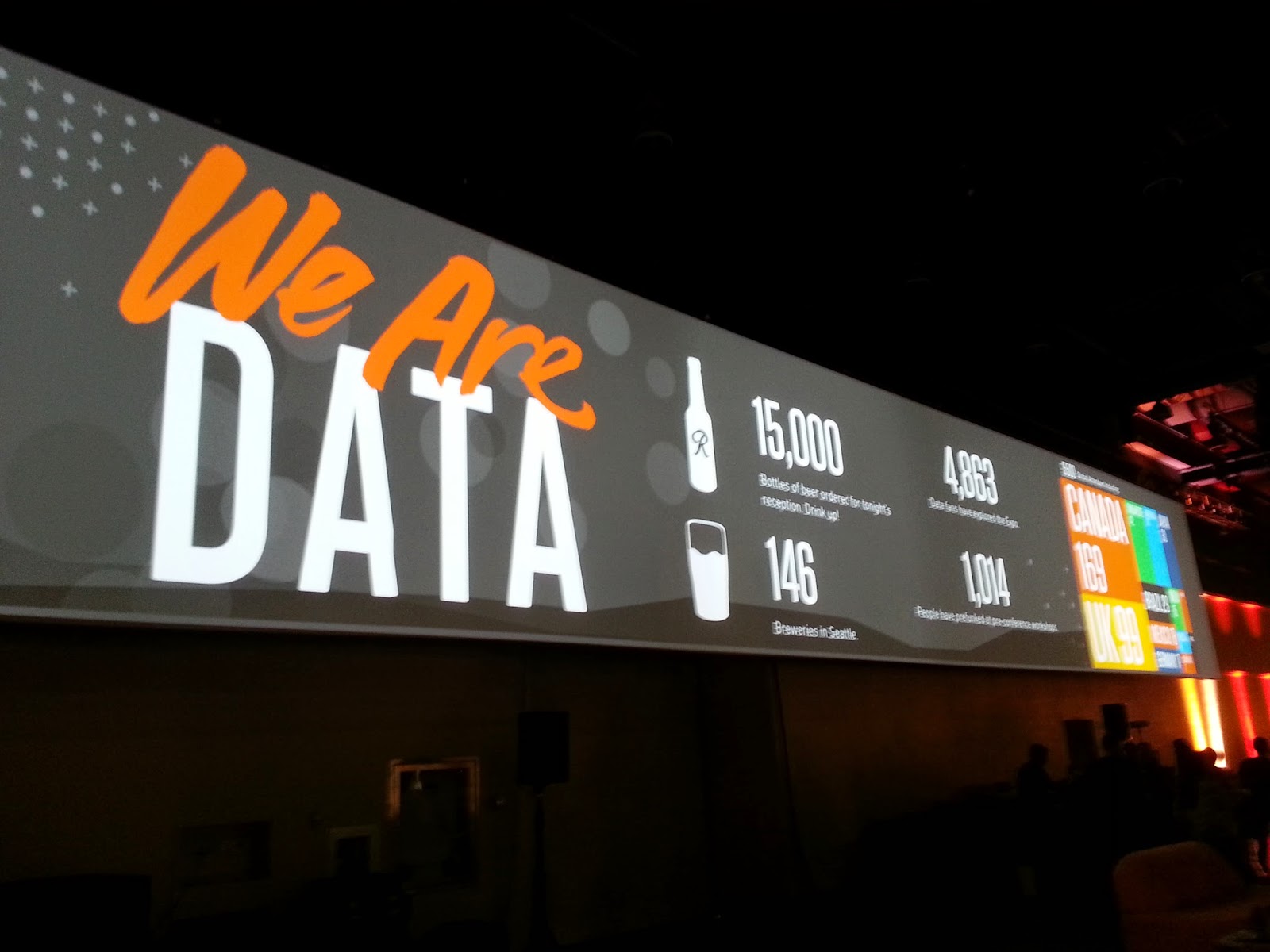
Having just returned from the 2014 Tableau Conference , I was debating whether or not I should blog about it. I realized I've received so much from the Tableau Community over the years that it would be a shame to not share my thoughts. So, here we go ... TABLEAU CONFERENCE IS BIG! One thought that definitely stuck out was the sheer size of this year's conference! There were 5,500 attendees so it was definitely crowded at times. But it was a reminder of the incredible growth that Tableau has been experiencing and how, so many others have found Tableau to be a tool that not only gets the job done, yet also delights. I like how one person said that Tableau is the closest thing he's found to playing a video game at work . I totally agree! If you're going to attend one data/analytics conference during the year, this is the ONE you want to go to. I was anticipating the first keynote because it always sets the stage for what is to come. Having heard Christian ...

The Designer Guide to Data Visualization

Image
Just came across this cool graphic from Visually : "A useful chart was put together to serve as a guide when working with data visualization. Look at it as a “What is Data Visualization?” guide.  Depending on which way you angle the infographic, you will get different results. It all depends from what angle you wish to showcase your data." Very cool. :) Explore more visuals like this one on the web's largest information design community - Visually .

Creativity Tip Sheet

Image
Found this awesome Creativity Tip Sheet from the folks at Unstuck . Love their website and all the resources that they provide! More and more there is this convergence of the creatives and the data folks. The best data visualizations are definitely a result of data + design. Hope this tip sheet will inspire creativity in you, especially, when you're feeling stuck. Enjoy!

The Social Media Viz Champion is ...

Image
Wow, didn't even think it was possible, but I actually won the Crowd Favorite in the T ableau Social Media Viz Contest ! Thank you to all who checked out my twitter feed viz and for those of you who voted for me!! Really appreciate it! Be sure to check out all the amazing entries ... so much creativity and talent.  Keep on doing incredible work!! :)

twitter feed v2

Image
One of the wonderful things about Tableau is that you can always find a new way to do something. Even though I already submitted my entry for the Social Media data viz contest, I wanted to use waffle charts that I found here . I modified the waffle charts slightly - it's fun to try using circles instead of squares just to give it a different look. Waffle charts aka square pie charts work well for summary information, but the downside is that they take up a lot of space on the screen. The hardest part was being able to provide a global filter across multiple data sources. And I found out that the only way to really do it is to use a parameter which does require both data sources to have a common field. Big props to Jesse Gebhardt for the help with getting the parameter option to work with these waffle charts! And for providing the template for creating waffle charts in Tableau. This viz breaks down the four groups (Apps, Buffer, Social, and Web) by weekday %. Thought it'...

twitter feed metrics

Image
Tableau is holding another viz contest , this time using any type of social media data. Since I've been tweeting a lot more lately, I thought it'd be very interesting to analyze my own tweets and of course, to enter the contest. :) Twitter makes it super easy to download an archive of all of your tweets (you can request this archive in the settings of your twitter account). Once I downloaded the data, I ended up grouping my tweets into four main categories: Apps - iOS & Android apps such as Flipboard, Zite, YouTube, etc.  Buffer - One of my favorite sites for spacing out your tweets according to a set schedule. I've been using it quite frequently (http://bufferapp.com). Social - Twitter, Instagram, Pinterest Web - Websites that I let tweet for me, the majority of them were done via a "Share button." Some interesting pieces of data that I found after analyzing my tweets: I have a total of 4,540 tweets since I began using twitter in August 20...

Infographics

Image
It's quite amazing to see the explosion of data + design. Everywhere you look, data is now being communicated in a visual way. The most common occurrence of this intersection of data + design occurs with infographics. One infographic that is able to communicate a wealth of information in a visual way is the 2014 US Federal Budget from Visual.ly : Death and Taxes 2014: US Federal Budget infographic by jess .

Viz Makeover

Image
With the release of Tableau 8 , there are a host of new features including brand-new visualizations. I took one of my old visualizations and revamped it with things you can only do in version 8. Here's a summary of the things I changed from my original U.S. Unemployment Rate Viz: Decided to pull the latest unemployment data from the U.S. Bureau of Labor Statistics (data is up to Feb 2013).  Utilized a treemap to show the Unemployment Rate % by state (from 2000-2012). Treemaps are an effective way to show many slices of information! Tried using the new packed bubbles visualization to display the U.S. annual unemployment rate (avg) from 2000-2012. It's a catchy way to show information although it can be a bit tricky to use since it may or may not be more effective than your standard bar chart. I'll let you decide. :) Floating containers everywhere! Added text to guide the user on how to use the map as a filter, put color legends closer to the visualizations, and pu...

Tableau Customer Conference 2011

Image
If you haven't already, you should definitely register for this conference ! I've never been, but I'm looking forward to learning how to become a Tableau pro. It's going to be really special meeting other data analysts and other data heads/enthusiasts I've corresponded with in various forums such as LinkedIn and Twitter. Hope to see you there! Oh, and did I mention the conference is in Vegas? Just in case you needed more incentive to attend!

Helpful Articles

Here's a list of useful articles I've found perusing various websites, blogs, tweets, facebook statuses, etc. The amount of information available is incredible. So much to learn when it comes to data!  Enjoy! 1)   How To Use Facebook To Market Your Brand  - Social media isn't the future. It's the present and those who utilize it well have a huge advantage. Marketers already know this. 2)   Data driven: Improving Business and Society Through Data  - How is data changing the world? Special section from Forbes that focuses on the impact of data. 3)   How to Visually Improve Your Meetings  - We all have meetings we'd rather not attend ... how can we improve them? 4)   The Interconnected World of Tech Companies  - This is such a sweet infographic! Tech is connected in many more ways that you can imagine. 5)   The Org Charts Of All The Major Tech Companies  - A funny look at how the top companies are organized ... do you think ...

The Fab Five Viz

Here's a viz I created using Tableau Public .  An easy tool to use that helps you find insights from your data faster. Try creating a data viz and enter the Public Data Contest . Would be amazing to win a free trip to Vegas! <a href="#"><img alt=" " src="http://public.tableausoftware.com/static/images/Co/Comparison/Dashboard1/1_rss.png" style="height: 100%; width: 100%; border: none" /></a> Powered by Tableau

Data Cake

Image
This is such a great metaphor for all those who love and interact with data.  What do you think? Thanks to Epicgraphic.com !   Image by EpicGraphic